Why Bright Colors Photograph Better on Brown Skin
Some outfits look amazing in photos while others disappear. Here's why saturated colors consistently win on camera for brown skin.
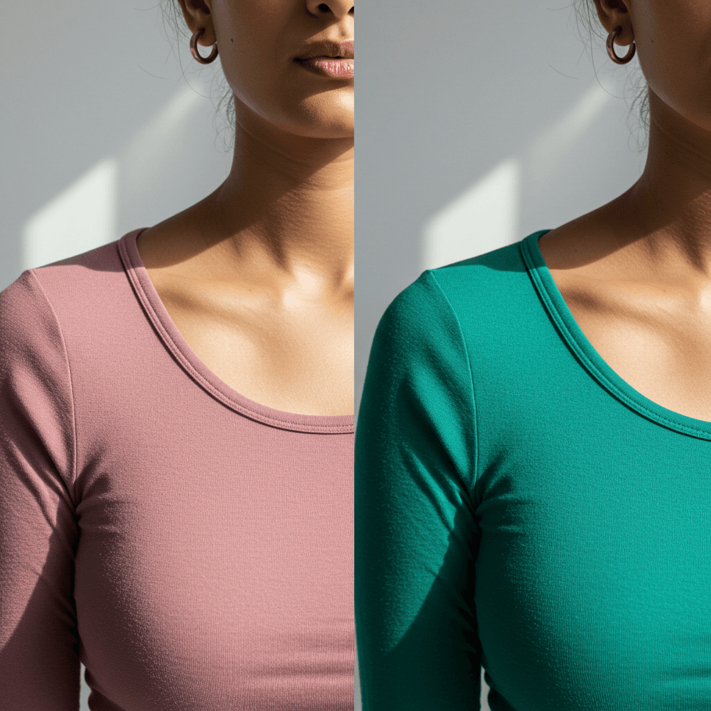
Bright, saturated colors photograph better on brown skin because cameras need high contrast and color intensity to register tones clearly. Melanin absorbs light, which means clothing colors need enough saturation to create visible separation between your skin and what you're wearing. Muted colors don't have enough intensity. They get absorbed into the overall tone of the image and photograph as nearly grey, even if they looked soft and flattering in person.
This is particularly consistent with jewel tones: emerald, sapphire, ruby, deep teal. They maintain their color identity under flash, artificial lighting, and image compression in ways that dusty rose or muted sage cannot.
The Outfit That Looked Great Until You Saw the Photos
You felt good in it. The mirror approved. Then you see the pictures and something's off.
The color looks dull. Your skin looks washed out. The whole vibe just doesn't translate.
Meanwhile, that bright emerald dress you wore last month? Every photo is fire.
The difference isn't luck. It's how color intensity interacts with melanin on camera.
How Melanin Changes the Photography Game
Brown skin doesn't just sit there passively in photos. It absorbs and reflects light in specific ways because of melanin.
When light hits your skin, melanin absorbs some wavelengths and reflects others. That's what creates your skin's natural depth and dimension. But cameras don't capture light the same way your eye does. They need more contrast and saturation to register color accurately.
Muted colors don't have enough intensity to hold up against that depth. They get absorbed into the overall tone of the image. The camera reads them as almost neutral, so they disappear.
Bright, saturated colors have enough punch to maintain their identity. They don't get swallowed by your skin tone. They show up clearly as distinct colors, creating the contrast that makes photos look sharp and vibrant.
What Happens With Muted Colors
Dusty rose, sage green, muted lavender. They're trendy. They look soft and romantic in styled photoshoots with lighter skin tones.
On brown skin, they often photograph as almost grey. The color is there technically, but it doesn't read as a clear, distinct shade. It just looks faded.
Your skin ends up looking dull too, because there's not enough contrast between your skin and the clothing. Everything blends together in a way that drains the life out of the image.
You're not imagining it. The physics of light and melanin just don't favor low-saturation colors in photographs.
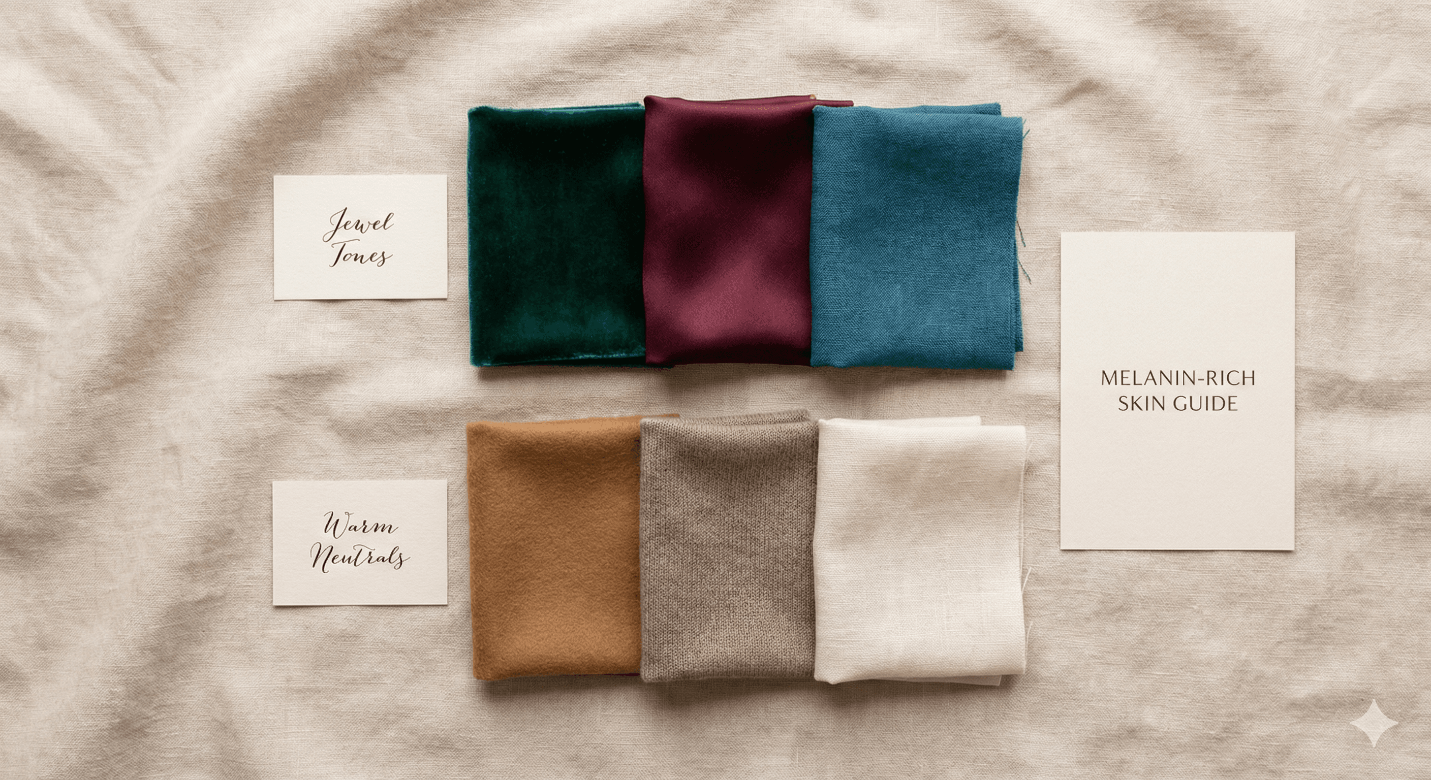
Why Jewel Tones Keep Winning
Jewel tones have three things that make them photograph beautifully on brown skin.
High Saturation
These colors are rich and intense. Emerald green, sapphire blue, ruby red. They're not trying to be subtle. That intensity means they maintain their color identity even when the camera compresses the image. They don't fade into your skin tone.
Clear Color Identity
There's no ambiguity with jewel tones. Emerald is clearly green. Ruby is clearly red. The camera doesn't have to guess what color it's looking at. That clarity translates to photos that look crisp and well-defined.
Strong Light Response
Jewel tones reflect light without getting washed out. They have depth, so they catch light in interesting ways without looking flat. When light hits a jewel-toned fabric, the camera picks up dimension and richness.
That's the difference between a photo that looks alive and one that looks flat.
The Contrast Factor
Photography is basically about contrast. Light against dark. Color against neutral. Sharp against soft.
Brown skin already brings natural depth to a photo. When you pair that with a muted color, you don't get enough contrast. The image looks muddy.
Bright colors create clear separation between you and your clothing. Your skin looks radiant because there's actual visual difference between your skin tone and what you're wearing. The camera can distinguish between the two, so both show up well.
This is why you can wear a bright fuchsia dress and look incredible in photos, but a dusty mauve in the same lighting looks completely different.
What About Different Skin Depths
This applies across all shades of brown skin, but the effect is stronger the deeper your skin tone is.
Light to Medium Brown Skin
You have more flexibility. Muted colors might work in perfect lighting conditions, but bright colors will consistently photograph better. You can get away with softer shades occasionally, but jewel tones will always be more reliable.
Medium to Deep Brown Skin
Bright colors are your best bet for photos. The contrast you create with saturated colors makes everything look intentional and polished. Muted colors will almost always wash out.
Very Deep Brown Skin
This is where bright colors really shine. The natural depth of your skin demands colors with equal intensity. Jewel tones, vivid brights, and rich saturated colors photograph beautifully. Muted or pastel shades will nearly always disappear on camera.
Lighting Conditions Make It Worse
Muted colors struggle even more in challenging lighting.
Indoor lighting with warm or cool casts? Muted colors get muddied. Bright colors hold their own.
Harsh midday sun? Muted colors wash out. Bright colors maintain their saturation.
Flash photography? This is where muted colors really fail. Flash tends to flatten images, and low-saturation colors lose what little definition they had. Bright colors still show up clearly.
Golden hour is the one exception where muted colors have a fighting chance, but even then, jewel tones will photograph better.
The Colors That Never Fail
If you want to guarantee good photos, these are your safest bets.
Emerald green photographs incredibly well across all brown skin tones and all lighting conditions. It's saturated enough to hold up on camera and flattering enough to make skin look radiant.
Ruby red and burgundy create stunning contrast without being too cool or too warm for most undertones.
Deep teal balances blue and green in a way that works beautifully on camera. It's rich without being overwhelming.
Sapphire blue is especially good for cooler undertones. It photographs as a clear, true blue rather than getting muddied.
Fuchsia and magenta are surprisingly versatile. They're bright enough to show up clearly but not so aggressive that they overwhelm your skin.
What This Means for Your Wardrobe
If you care about how you look in photos, color intensity should be part of your decision-making.
For important events where photos matter, choose saturated colors. Weddings, parties, professional headshots, special occasions. Bright jewel tones will serve you better than trendy muted shades. Our best jewel tones guide for brown brides covers specific color choices by undertone and event type.
For everyday wear where you're not thinking about photos, wear whatever works. But if you do end up in photos, the brighter colors will consistently look better.
If you're building a wardrobe around colors that work for both daily wear and photographs, our flattering wardrobe guide explains how to build around signature colors that do both jobs. The same jewel tones and rich earth tones that photograph well are usually also the most flattering in person, because they match the natural chroma of brown skin.
Testing Your Colors
Before an important photo event, test your outfit options. Take photos in similar lighting to what you'll have at the event. Look at how the colors show up on camera, not just in person.
If a color looks vibrant and your skin looks clear in the test photos, you're good. If the color looks faded or your skin looks grey, choose something brighter.
Your camera roll doesn't lie.
Key Takeaways
- Brown skin's natural depth needs high-saturation colors to create enough contrast for photos
- Muted and pastel colors often photograph as nearly grey on brown skin
- Jewel tones maintain their color identity and vibrancy on camera
- The deeper your skin tone, the more important color saturation becomes
- Challenging lighting conditions make the difference between bright and muted colors even more dramatic
Frequently Asked Questions
Does this mean I shouldn't wear muted colors at all?
Not exactly. Muted colors can still look fine in person, and if you're not worried about photos, wear what you like. The point is that muted colors are less reliable on camera for brown skin. If you're dressing for an event where photos matter, a bright alternative in the same color family will serve you better. Muted sage photographs worse than saturated emerald, but you don't have to abandon green as a color.
What bright colors work for professional or office photos?
Sapphire, deep teal, forest green, and burgundy are the most professional-reading bright colors. They have the saturation to photograph well without reading as bold or casual. Bright fuchsia or magenta works for some environments and looks great on camera, but may not suit every workplace culture. Jewel tones in these teal/blue/green/red family tend to be the safest bets for headshots and professional settings.
How do I make muted colors work better on camera if I have to wear them?
Professional photography lighting and post-processing can help. Better ambient lighting reduces the washout effect. If you're wearing a muted top, you can try adding a piece in a brighter undertone-appropriate color closer to your face (a jewel-tone jacket, scarf, or statement jewelry) to add the contrast that the muted base color lacks. It doesn't fully fix the problem, but it helps.
Does skin depth affect which bright colors photograph best?
Yes. Deeper skin tones need higher saturation and can carry more intensity. Very deep brown skin looks particularly good in bright jewel tones and vivid brights because the depth creates enough visual weight to match them. Light-to-medium brown skin has a bit more flexibility and can carry slightly lower-saturation options, though jewel tones still photograph better than muted alternatives across all depths.
Ready to discover your perfect colors? Get your personalized color analysis with CAPSI.
Ready to Discover Your Perfect Colors?
Get your personalized color analysis with CAPSI's computer vision analysis system
Get Your AnalysisAbout CAPSI Team
The CAPSI team is dedicated to providing science-backed color analysis and styling guidance for South Asian individuals.
Related Articles
Why Most Color Analysis Tools Get Brown Skin Wrong
Western color analysis systems were never calibrated for melanin-rich skin. Here's the science behind why they fail brown skin — and what a system built for South Asian complexions actually looks like.

Complete Guide to Color Analysis for Brown Skin
A science-backed guide to undertone, depth, chroma, and seasonal systems, and why traditional color analysis fails brown skin. Optimized for South Asian skin tones.
The Problem With AI Filters for Undertone Detection on Brown Skin
AI filters and beauty apps aren't built to analyze undertones accurately. Here's why they fail especially hard on brown skin.