Why Some Outfits Look Expensive Instantly on Brown Skin
The expensive look isn't about price tags. It's about color harmony. Here's how the right colors make any outfit look polished on brown skin.
The fastest way to make an outfit look polished on brown skin is to wear colors that create visual harmony with your undertone and chroma. When the color is right, even a basic silhouette reads as intentional. When the color is wrong, expensive pieces look off.
This isn't about style complexity or brand names. It's about color harmony. The visual system picks up on whether colors are working together or fighting. When they work, everything looks cohesive. When they clash, the brain registers a subtle wrongness even without being able to name it.
The right colors for brown skin depend on undertone and chroma. Get those right and basics look elevated. Get them wrong and designer pieces still look slightly off.
The Cheap Dress That Looks Designer
You've seen it. Someone walks in wearing what's clearly a basic outfit, nothing special about the cut or fabric. But somehow it looks expensive.
Then someone else shows up in designer pieces that look... fine. Nice, but not elevated.
The difference usually isn't the price tag. It's the color.
What Makes Something Look Expensive
"Expensive" is really code for polished, intentional, and harmonious. When an outfit looks expensive, everything seems to work together effortlessly.
Color is the fastest way to create that effect.
When your clothing colors harmonize with your skin tone, the whole look feels cohesive. There's no visual friction. Everything integrates smoothly. Your brain reads this as "put together" and "high quality" even if the actual garment is from a fast fashion brand.
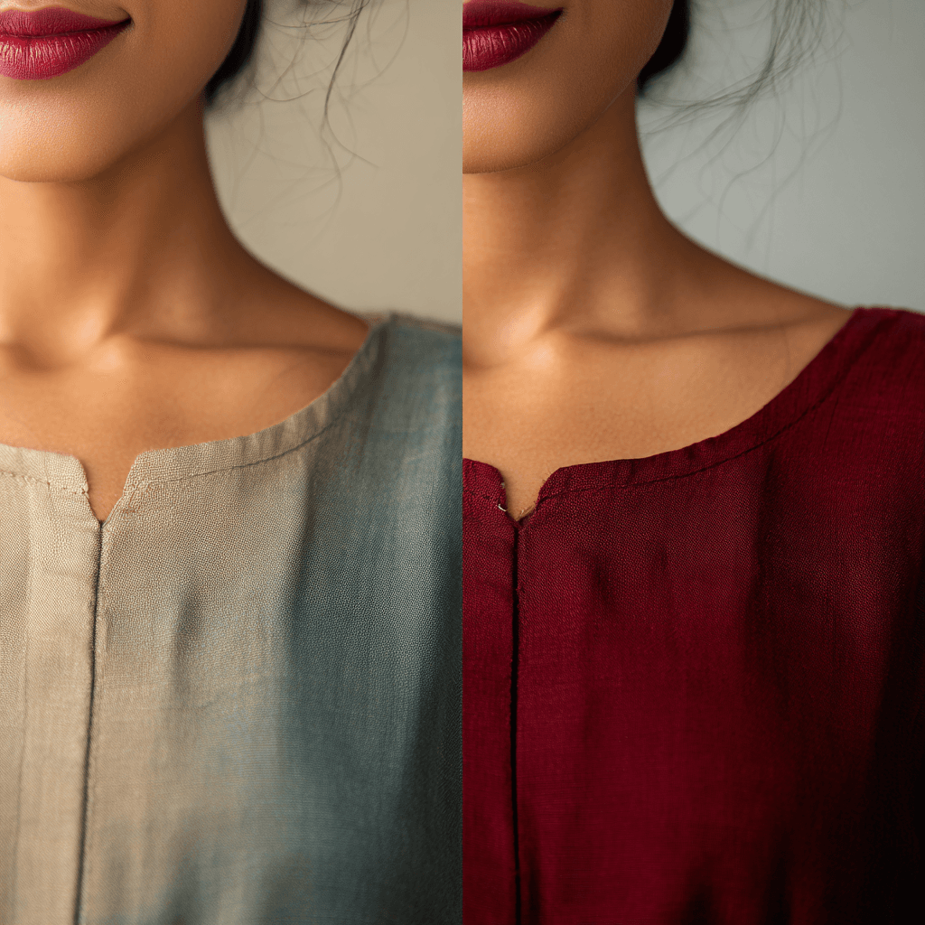
When colors clash with your skin, even expensive pieces look off. The discord creates visual noise. Your brain registers something isn't quite right, and the outfit reads as less polished regardless of quality or cost.
How Brown Skin Changes the Game
Brown skin has natural richness and depth. When you pair that with the right colors, the effect is luxurious.
Deep Colors Create Instant Elevation
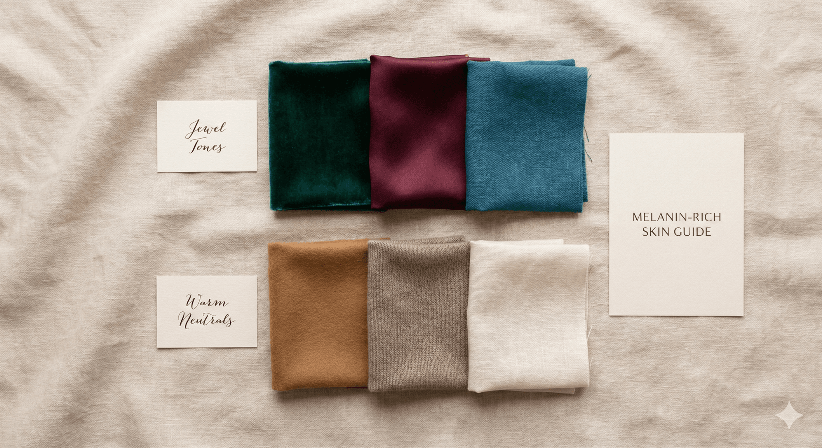
Rich, saturated colors look especially stunning on brown skin. Emerald green, burgundy, deep navy, chocolate brown. These colors have the intensity to match melanin's natural depth.
The combination of deep skin tone with deep, saturated color creates a visual harmony that reads as sophisticated and intentional. It looks expensive because it looks cohesive.
Pale or washed-out colors don't create that same effect. They fight against your skin's natural richness instead of complementing it.
Clarity Matters More Than Complexity
A simple dress in the perfect shade of teal will look more expensive on brown skin than a complicated outfit in muddy, muted tones.
Clarity means pure, saturated color without greyness or dustiness. Brown skin typically has high natural chroma, which means it needs colors with equally high chroma to create balance. For a systematic approach to building outfits from your palette, see our flattering wardrobe guide. And for a full breakdown of which specific colors create this harmony by undertone, our complete guide to color analysis for brown skin covers the full picture.
Muted colors create visual confusion. Clear colors create visual harmony. Harmony looks expensive.
Contrast Without Chaos
Brown skin already provides natural depth. When you add the right colors, you create contrast without overwhelming the eye.
A crisp white shirt on deep brown skin creates striking contrast that looks intentional and polished. The same white on lighter skin might not have the same impact.
But the wrong neutral (like beige or grey on warm undertones) creates muddy contrast that looks accidental rather than deliberate.
The Colors That Elevate
Certain colors consistently look more expensive on brown skin than others.
Jewel Tones
Emerald, sapphire, ruby, amethyst. These have depth, saturation, and clarity. They mirror the richness of brown skin and create instant visual interest without looking busy.
Even a basic t-shirt in a jewel tone looks more put together than a structured blazer in a muddy neutral.
Rich Neutrals
Chocolate brown, warm charcoal, cream, deep navy. These have enough depth and saturation to hold their own against melanin-rich skin.
They create a sophisticated neutral base without the washing-out effect of beige or light grey.
Pure Whites and Creams
Stark white creates beautiful contrast on brown skin. It looks crisp and intentional rather than harsh.
Cream works especially well on warm undertones, creating a softer but equally polished effect.
Both look more expensive than off-white or dingy neutrals.
Bold Saturated Brights
Fuchsia, bright teal, vivid coral (on warm undertones). These might seem too bold to be "sophisticated," but on brown skin, they create a striking, confident look that reads as expensive.
The key is that they're clear and saturated, not neon or muddy.
What Kills the Expensive Look
Just as certain colors elevate, others drain sophistication.
Muted Pastels
Dusty rose, sage green, pale lavender. These lack the intensity to create harmony with brown skin. They look washed out and cheap, even in expensive fabrics.
Muddy Neutrals
Beige, light grey, taupe (unless very warm). These sit in an awkward middle ground. Not light enough to create contrast, not saturated enough to create harmony.
They make everything look dingy regardless of quality.
Wrong Undertone Colors
Orange on cool undertones. Icy pink on warm undertones. These create visual discord that reads as "off" even if you can't pinpoint why.
Discord never looks expensive.
Beyond Color: How Color Affects Perception of Fit
Here's something interesting: the right color can make fit issues disappear, while the wrong color highlights them.
When you're wearing a color that harmonizes with your skin, people notice the overall effect. The color draws the eye and creates a cohesive impression.
When you're wearing a color that clashes, people's eyes start searching for what's wrong. Suddenly, minor fit issues become obvious. The outfit feels like it doesn't quite work.
Same garment, different color, completely different perception of quality.
The Monochrome Trick
One of the easiest ways to look expensive is monochrome dressing in your best colors.
All cream. All chocolate brown. All deep teal. The simplicity reads as intentional and sophisticated, especially when the color harmonizes with your skin.
This works because there's no visual complexity to distract from the overall harmony. Everything flows.
It only works if the color is right, though. Monochrome beige on most brown skin just looks washed out.
Mixing Colors Strategically
If you're not doing monochrome, limit your palette to two or three colors that work together and with your skin.
Deep navy and cream. Emerald and chocolate brown. Burgundy and warm charcoal.
The simplicity looks expensive. Too many colors, even if they're individually flattering, creates visual noise.
Fabric Quality Still Matters (But Less Than You Think)
A great color in cheap fabric will often look better than a bad color in expensive fabric.
That said, when you combine the right color with decent fabric quality, the effect is amplified. The color makes the fabric look richer than it is.
Prioritize color first, then invest in better fabric quality for pieces in your best colors.
Testing for the Expensive Effect
Want to know if a color makes you look expensive? Take a photo.
Photos amplify color effects. If a color looks polished and harmonious in photos, it's creating the expensive effect. If it looks washed out or muddy, it's not, regardless of how much you paid for it.
The camera doesn't lie about color harmony.
Building an Expensive-Looking Wardrobe on Any Budget
You don't need designer clothes. You need the right colors in clean, simple silhouettes.
Start with basics in your most flattering colors. A well-fitted top in your perfect shade of emerald will look more expensive than a trendy piece in a color that washes you out.
Add rich neutrals that create depth rather than muddy your complexion.
Skip muted tones and muddy neutrals entirely, regardless of trends.
The result will look more expensive than a closet full of designer pieces in wrong colors.
Key Takeaways
- Color harmony creates the perception of quality more than price or brand
- Brown skin looks most polished in deep, saturated colors with clarity
- Jewel tones, rich neutrals, and bold saturated brights elevate instantly
- Muted pastels and muddy neutrals undercut the overall look
- Simple silhouettes in the right colors beat complex outfits in wrong ones
Frequently Asked Questions
Why do my expensive clothes sometimes still look cheap?
The price of a garment doesn't override color mismatch. If the color fights your undertone, the discord reads as "off" regardless of fabric quality. An expensive piece in the wrong color will look less polished than a basic piece in the right one. The brain registers harmony first, then quality.
Can pastels ever look polished on brown skin?
Rarely. Pastels have low chroma, and brown skin typically has high natural chroma. The mismatch in intensity reads as washed out rather than soft. The exception is warm pastels on light-to-medium brown skin with warm undertones, where warm peach or butter yellow can work. Cool or dusty pastels are much harder to pull off.
What's the fastest way to look more put together?
Wear one color that you know works on your skin in a clean, well-fitted silhouette. Monochromatic dressing in a flattering color is harder to get wrong than mixing multiple shades. Chocolate brown, deep teal, or burgundy in a single-color outfit will read as intentional and sophisticated on most brown skin tones.
Do prints and patterns work, or should I stick to solids?
Prints work if the dominant color in the print is from your palette. A floral with a teal base will read differently than one with a sage base on olive undertones. When in doubt, test how the print looks against your face in natural light. If the colors sitting nearest your skin are flattering, the print will work.
Ready to discover your perfect colors? Get your personalized color analysis with CAPSI.
Ready to Discover Your Perfect Colors?
Get your personalized color analysis with CAPSI's computer vision analysis system
Get Your AnalysisAbout CAPSI Team
The CAPSI team is dedicated to providing science-backed color analysis and styling guidance for South Asian individuals.
Related Articles
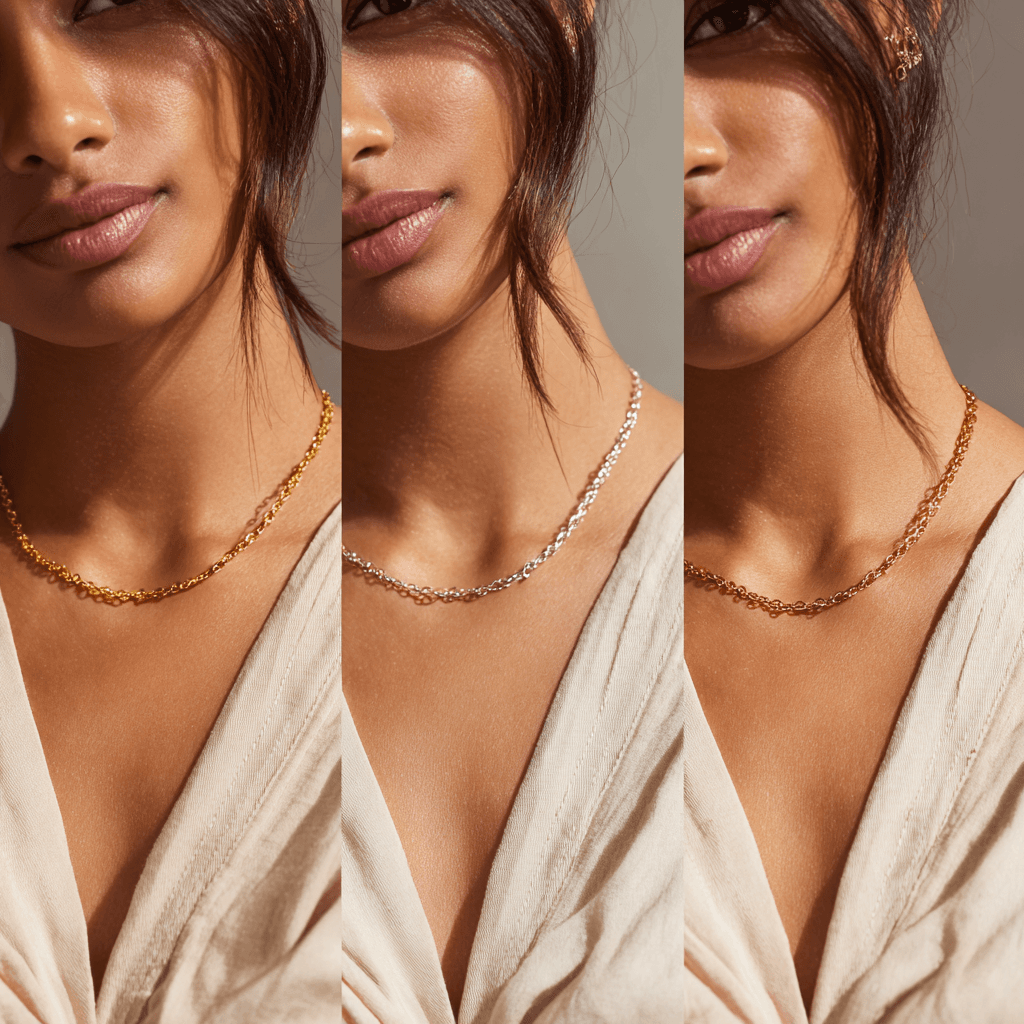
Rose Gold vs Gold vs Silver: Which Metal Actually Looks Best on Brown Skin?
The jewelry metal you choose affects how your skin looks. Here's how to pick between gold, silver, and rose gold based on your undertone.
Why Most Color Analysis Tools Get Brown Skin Wrong
Western color analysis systems were never calibrated for melanin-rich skin. Here's the science behind why they fail brown skin — and what a system built for South Asian complexions actually looks like.

Complete Guide to Color Analysis for Brown Skin
A science-backed guide to undertone, depth, chroma, and seasonal systems, and why traditional color analysis fails brown skin. Optimized for South Asian skin tones.